In what ways does your product use develop or challenge forms and conventions of real media products?
At the beginning of my media product I wished to create a magazine that challenged the forms and conventions of a stereotypical music magazine. However, after submitting my first radically unconventional draft of my magazine front cover to a focus group of my target audience, I found that the vast majority thought it was overly tacky and unattractive so I made the decision to drastically alter my design. I did however, decided to maintain certain elements of the original, like unique editing of images that were originally inspired by Q magazine and their front cover based on the popular cartoon music group the Gorillaz and their resurgence in the music charts with a new album. I attempted to maintain an element of animation in my main draft of my magazine. I adhered to many of the rules that all good magazines utilize, such as a house style and colour scheme while using Adobe Photoshop to edit and crop my pictures, making them appropriate and attractive to my target audience. Converging the images and text is extremely important and can be done with captions, and making the layout appropriate to the predetermined conventions of a front cover because otherwise a front cover may look messy, for example never covering the face of an image as this could alienate the audience while making the layout of a magazine look poor.
How does your media product represent particular social groups?
The magazine was based on new alternative rock music and famous rock stars and this content is predominantly followed by the 16-19 year old demographic making these groups my target audience. I focused on the fact that modern teenagers are generally considered more mature and edgy than the same groups thirty years ago, with this in mind I decided that in the current politically correct environment challenging rules and concepts of what is “appropriate” may be an attractive quality in my magazine, this realization influenced the mode of address and house style of my magazine particularly.
This idea of controversial subject matter and PC (political correctness) gone mad led me to create “Roger Pain”, a reclusive wild child, rock star who had disappeared into obscurity after producing some very popular music, I deemed this angle an attractive enough focal point for this issue of the magazine assigning it my feature article. I used a scenario in which Pain has recently come out of his self imposed estrangement from the music business to grant my magazine an exclusive interview and finding that Pain has recently begun to create music again and learning of the changes he has undergone and how he has recovered from his prior issues.
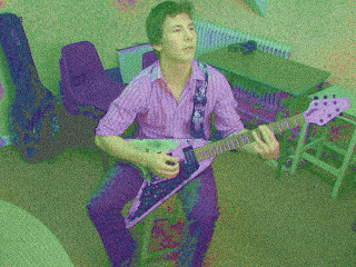
I believe that this scenario will work as it has been shown many times that an audience loves an “Underdog Story” in which a character who has failed and been defeated triumphs over adversity. Making the article an exclusive supported the vogue and intrigue around the seminal character; I used Adobe Photoshop to edit and crop the pictures of the person I was using to model as the character Roger Pain. The pictures were taken at a small gig as I decided that since Pain was reclusive and controversial, it would be a contradiction if he was performing to thousands of people. So I decided that an intimate gig in a small venue would fit Pain’s persona well. I decided to edit the pictures of Pain to give them a tint that would have subtle implications about Pain’s frame of mind and past, giving a “devil may care”, drug addled, rocker look that would appeal to my target audience’s imaginations and alter their opinions of Pain’s character. the pictures are also edited because they will attract many reader not from my target audience, who are just interested in what the front covers picture represents, this ambiguous image will strengthen my front cover and the intrigue around this issue of the magazine.
What kind of media institution might distribute your media product and why?
There is a wide range of institutes that would distribute my media product such as any aspect of the music industry, for example it is not uncommon for a powerful organization such as Q to have a smaller niche market magazine sold inside or separately. However many music magazines have institutions that are not relevant to the genre and these magazine’s often don’t refer to their father companies, for example Mojo, that is published monthly by Bauer London Lifestyle ltd. Some magazines don’t need an industry to support them and are self sufficient and to gain money they may sell advertising space. My magazine’s institution is the Fender guitar manufacturers; who are well known for their involvement in the music industry, funding musical performances and selling musical equipment worldwide. I noticed that many magazines would credit their institutions in their contents pages and I decided to do something similar, advertising Fender products and offering one as a prize.
Who would be the audience for your media product?
As I have already mentioned my magazine is aimed at a younger demographic and focuses on alternative rock music, making it a niche product. This is reflected in the mode of address as all content, including editorials, are created with the assumption that the reader understands what is being said. After establishing my target audience I had to consider what would make the product attractive and fulfilling for the customer, for example magazines aimed at teenagers are often relatively cheap averaging around the one to two pound price margin so I changed my original price from£4.50 to £1.50. There is also an assumption that members of my target audience are easy to influence making them more susceptible to the hypodermic and cultivation audience theories and this could increase the sales of my magazine.
How did you attract/address your audience?
I attracted my audience by using unique graphics, including an exclusive and an indexical masthead which could also be seen as an arbitrary sign as New World Music or NWM as it could become easily culturally learned like “Q” magazine. I address the audience with simple lures on the front page of my magazine to inform them as to the subjects addressed in the magazine, while using a strict house style and typeface throughout the magazine to prevent confusion and making the magazine flow, which I believe is an attractive quality. The feature article itself is focused on the aforementioned Roger Pain, who is a popular musician, and I believe my audience would want a descriptive and personal interview with their icon. I believe that due to the creation of a main male character in the magazine you could argue that the article does vaguely adhere to both Propp and Todorov’s theories of a story as the hero (Pain) is seeking artistic justification and “struggles” with drug addiction and eventually achieves recognition (being reported on in the magazine) which is reminiscent of Propp’s theory. The “Pain” story is also similar to Todorov’s ideas as Pain’s career starts relatively simply (almost the stereotypical singer success story) and is fractured by his erratic (drug Influenced) behaviour and then Pains career gets back on track, much like Todorov’s theory that a story starts in a state of equilibrium, the equilibrium is disrupted then the equilibrium is reinstated. I had to ensure that the front cover had a quality to it that would draw in a reader, and not just members of by products target audience. Through the house style, colour scheme, articles and images I have tried to utilise the Hypodermic syringe model which means what the title implies; you inject ideas, attitudes and beliefs into your audience to draw them into your magazine's subject matter. I believe that the images I have used will, almost on a subconscious level, make the audience create an image of pain that is the stereotypical, wild, drug fuelled rocker look. I then use the term "reclusive" which creates confusion for the reader, as this is a contradiction to their preconceived notions of what Pain is. I will then create a unique image of this character through the article focused on him, challenging the stereotypical image the character would normally have presented. This, I believe, will leave the reader having an altered perspective and opinion of the character which will leave them with an altered emotional state, which adheres to Maslow's theory of the hierarchy of needs and that consumers are seeking a fulfilment of needs. If a reader is affected in any way by my product, the two step flow audience theory dictates that they will be likely to discuss it with others.
What have you learnt about the technologies from the process of constructing this product?
I have learnt a lot about the process of editing and managing different pieces of media, for example. I have learnt how to utilize file management software to organise the different aspects of my media project also uploading images noting that the camera work itself is integral to the magazine’s successes. For example, on my front cover I used a low angle, wide shot to establish a dominant physical presence that the character Roger Pain possesses. I edited the images using Adobe Photoshop to give them an attractive yet unique appearance. I also used Adobe on my potential colour schemes to create a trend giving the magazine that all important flow, then implicating a layout and house style that fits the magazine’s colour scheme, while maintaining a unique feel. Another piece of technology that was used was a Blog. As it was decided that instead of using paper, which is easy to lose and damage, a student could simply post any developments directly onto their Blog. I learned that to make a descent magazine and Blog all work should be organised and posted in order, documenting every development.
Looking back at your preliminary task, what do you feel you have learnt in the progression from it to the full product?
I believe I have learnt much as I have advanced through the task, notably my understanding of my audience, thanks mainly to the fact that I’m also a member of my own target audience, and my understanding of the ideologies behind texts, for example my music magazine and every other music magazine, has an agenda beyond informing its readers of new music and popular songs; their primary objective is to make money whether that’s through advertising, selling magazines and selling music as well.
My personal development as a media studies student can be credited to learning how to manage and effectively the new hardware and software that I was asked to use. for example the new computers that I had to use were easier to use but to begin with the memory and folder system was hard to understand, also the use of Adobe software was very difficult as the system was completely alien to me and it took me one rather dreadful attempt at a front cover to begin to understand how that software worked. I also credit reading many other magazines contents pages, front covers and double paged spread which strengthened my knowledge of the magazine industry.
In my magazine the institution behind it is not referenced often, which is not uncommon if the institution behind a product is unconventional feel I have also learned other aspects of what makes for an attractive magazine, for instance cleverly edited, cropped and captioned images drastically improve a magazine’s appeal, as well as an attractive masthead, lure, headlines, strapline and even the captions included all of which improve circulation among your target audience. To summarize I am happy with myself for producing the magazine I have, as I believe I have created a high quality hybrid magazine with an attractive and unique style, with synergy between the different aspects of the magazine making an easy to read edgy and attractive piece of media.
Friday, 30 April 2010
Thursday, 29 April 2010
Final Contents page
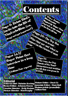
I decided to go with a background that was consistent with my house style utilising the black and white of my masthead and twining this with a blue that I then made similar to the deign of my front cover to give the magazine a flowing style.
After submitting this draft to a focus group I had reports that the background and the black boxes had a jarring effect so I edited the transslucency of the box to counter this.
Final comments from Target Audience on my Double Paged Spread
- Move Title
- Spelling
- Paragraphs
- Banner should be clearer
- Page numbers should be smaller and more centred in box's
I will adress these issues then publish my final draft
Focus Groups Remarks
The Focus group said very posative things about the picture section and the fact that it covered over one side saying that this was a new style few had seen before. however they highlighted certain elements that needed adressing.
- The article looks over simple next to the picture
- The other picture is of bad quality
- The purple righting colour is hard to read
- The Speach bubble is tacky

Pairing different aspects of my double paged spread
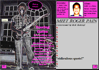
This is my double paged spread in a nearly completed stage, their are still aspects that I belive need to be changed but I have introduced a house style and colour scheme that will probably be adheared to. I will submit this to a focus group of my target audience for comment and changes that need to be made.
Final double paged spread image
Sunday, 25 April 2010
Double paged spread, Article Pictures.
After submiting my first draft to a focus group and finding that:
The picture was to small and to simple, the the colour scheme was unattractive and plain and that in my focus groups opinion a question and answer segmant was to common in my type of magazine, and to make my magazine unique I should try a more mature method.
I desided the first thing that needed to be imporved was the picture situation, so I took two pictures and edited them with Adobe Photoshop software to make them unique and attractive,then submitted them to a focus group to see which should be included in my double paged spread. These are the two images incontention for prime placement, however these exact styles are not concreate.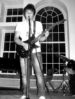


Friday, 23 April 2010
Thursday, 22 April 2010
Tuesday, 20 April 2010
the final draft of my front cover
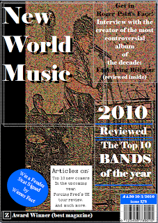 This is the final draft of my magazines front cover. As you can see I took a picture of the character I wished to be the focus of this issue of the magazine and used Adobe Photoshop Elements to make the picture more attractive, while also making it brighter than other options I had planned out. I use blue, Black and White as consistant colours throughout the magazine also using Elephant and Arial as the house fonts.
 results of focus group analysis
Unfortunatly, the feed back on my first attempt was extreamly negative, with comments like:
childish, tacky with contrasting colours and a rather hectic presentation.
I did also recive one posative comment saying that the idea of having somthing other than a picture of a person or persons was a good idea as it made my front cover stand out.
So I will redesign my front cover but consider making it unique and attractive.
Monday, 19 April 2010
the first draft of my front cover


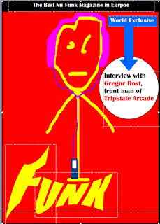
The two above sketchs were created in preperation for the creation of my first draft of my front cover. I attempted to create the first sketch with my first draft and I will then submit this draft to a focus group of my target audience, for feedback and I will then determine whether or not to continue with this version or to attempt to create another.
Subscribe to:
Comments (Atom)


