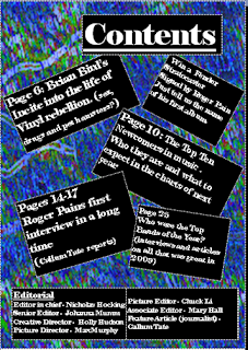
I decided to go with a background that was consistent with my house style utilising the black and white of my masthead and twining this with a blue that I then made similar to the deign of my front cover to give the magazine a flowing style.
After submitting this draft to a focus group I had reports that the background and the black boxes had a jarring effect so I edited the transslucency of the box to counter this.

No comments:
Post a Comment